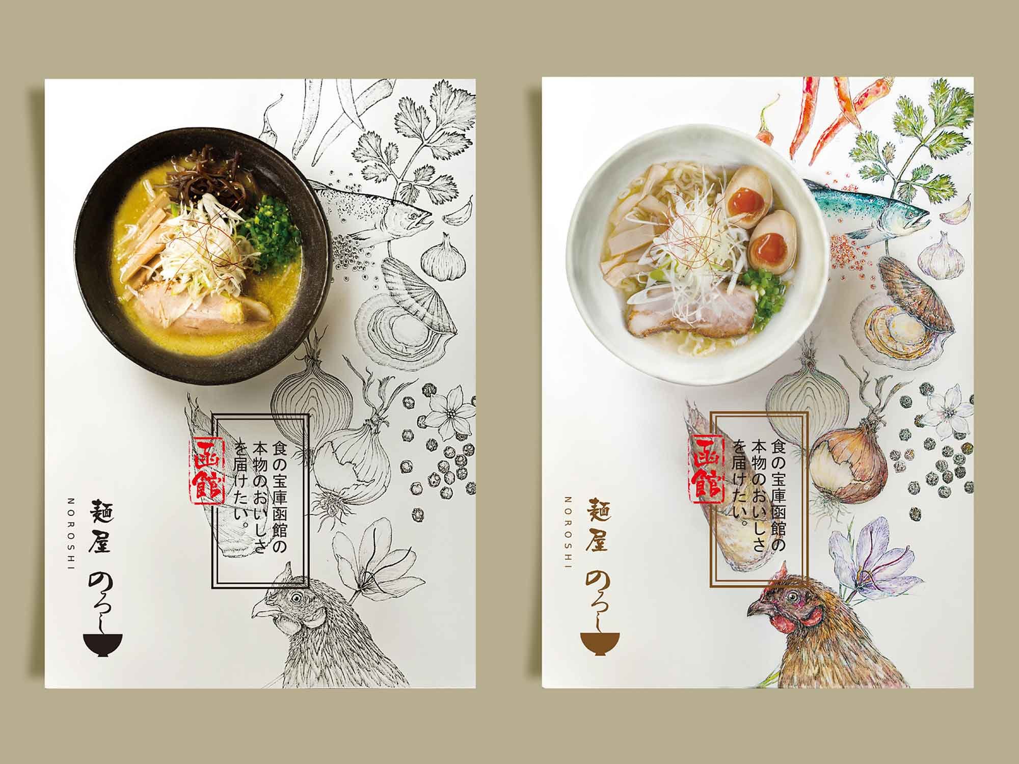
Art of Designing Menu
In the realm of culinary experiences, the art of designing a menu is an often-overlooked yet crucial aspect that can significantly impact a restaurant's success. While a formal education in typography may seem like a prerequisite, this article aims to provide restaurant owners and managers with valuable insights, inspiring fresh ideas for creating menu systems that captivate and entice.
Menu Layout Basics
☆ Consistency with Branding
Align your menu with your restaurant's ambiance and brand aesthetic. Ensure that the design mirrors the essence of your cuisine, tailoring it to suit the distinct atmosphere of a cozy cafe or the refined elegance of a five-star establishment.
☆ Limited Selection
Streamline your offerings for easy navigation. Strike a balance between simplicity and detail, making it effortless for customers to scan through while still highlighting the unique aspects of each dish.
☆ Utilize White Space
Embrace the power of white space to maintain a balanced and visually pleasing layout. Adequate spacing prevents overcrowding, allowing your menu's content to breathe and remain easily digestible.
☆ Understandable Icons
Employ icons to denote dietary preferences such as gluten-free, vegan, or vegetarian options, enhancing clarity for your diners.
☆ Strategic Use of Photos
While photos are typically omitted from menus, consider high-resolution images judiciously. For restaurants introducing unconventional cuisines to less familiar communities, a carefully curated selection of menu images can aid patrons in understanding the dishes.
☆ Appetizing Colours
Choose a colour palette that complements your brand identity while also appealing to the senses. Opt for lighter background shades coupled with bold, darker fonts and illustrations for an aesthetically pleasing contrast.
Importance of Online Menus
In today's digital age, the significance of an optimized online menu cannot be overstated. We recommend integrating your menu seamlessly into your restaurant's website and ordering system for a user-friendly experience.
As customers increasingly turn to online platforms for dining decisions, it's crucial to acknowledge that when patrons browse the online menu, there are no restaurant staff to guide them.
While a PDF version may suffice, an HTML-based design directly on the webpage enhances visibility and accessibility, making it easier for patrons to explore your offerings on various devices.
This thoughtful approach ensures that your virtual menu becomes a navigable and informative resource for diners, contributing to a positive dining experience even before they set foot in your establishment.
Closing
At Jung Shin Design, we understand that your menu is not just a list of dishes; it's a reflection of your culinary identity. Our team is committed to working closely with you to craft an outstanding menu that goes beyond the ordinary. By blending creativity with functionality, we aim to elevate your restaurant's appeal and contribute to increased sales.
Your success is our inspiration, and together, we can create a menu that leaves a lasting impression on your diners. Contact us today to start this exciting culinary collaboration.


